Accessible Skip Navigation Link
Published on:
Last updated: Wednesday, September 14, 2016.
If you have a suggestion or an issue please submit it on a11ymatters on Github.
Article Outline
Summary
Imagine that your mouse is not working and you want to use the keyboard to browse the web. With the skip link, you will be able to jump quickly to the content without tabbing through every single link in the website header.
As a user
- As a user, I should be able to skip to content quickly.
- As a user, I should know get that this is a button for skipping navigation.
Ingredients
- link
- positioning
What is a skip link?
When browsing a website with a keyboard, we need a quick way to skip a group of navigation items. Without that skip link, we will need to tab through the whole links to get out of the navigation area.
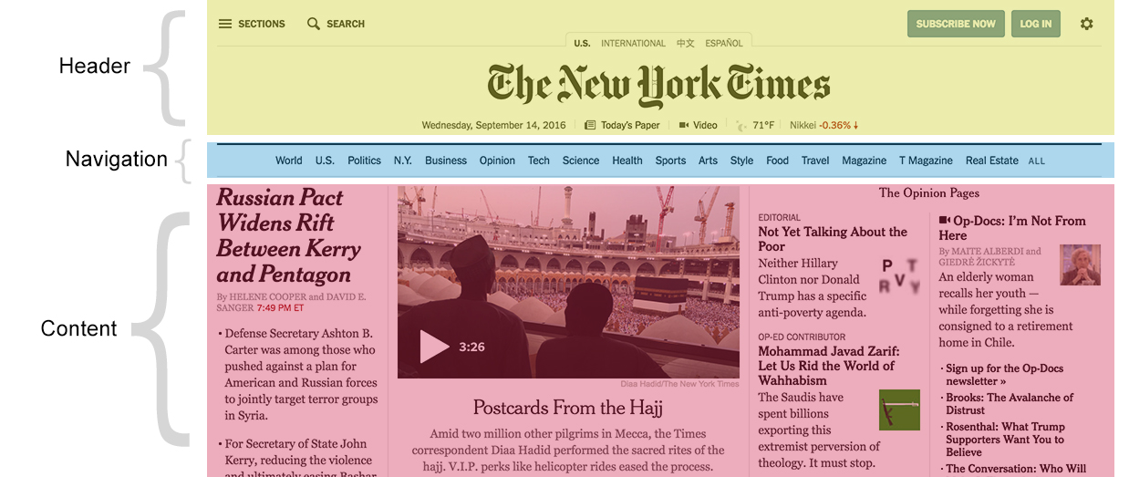
In small websites, it might be ok to tab through 5 links. Lets explore the below example of New York Times design.

How many tabs you need in order to reach the content area? In this design, we have almost 30 links to tab through.
New York times did a great job in order to make it easy for users to:
-
Skip to navigation
-
Skip to content

Implementing a Skip Navigation Link
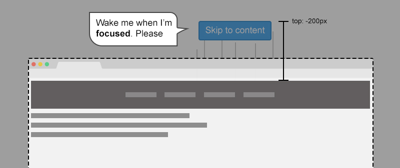
The idea is to place a link before all all focusable elements in the source order. That way, we can style the skip link and hide it off screen with CSS.
Then, inside href attribute we should add a # followed by the ID value of the content block.
1
2
3
4
5
6
7
8
9
10
11
12
13
<body>
    <div class="wrapper">
        <a class="skip-link" href="#content">Skip to content</a>
        <header>
            <nav>
                <!-- Nav links -->
            </nav>
        </header>
        <div id="content">
            <!-- Content goes here -->
        </div>
    </div>
</body>
1
2
3
4
.skip-link {
    position: fixed;
    top: -200px;
}

Notice the dotted line that represents the browser window. Anything goes outside it is hidden off-screen.
When pressing on tab key, the first element that will receive focus is the skip link element. Why? because it’s the first one in the source order.
In CSS, we will tell the browser in case the link is focused, show it at the top of the screen.
1
2
3
.skip-link:focus {
    top: 0; /* Now the link will appear */
}

Use em for the positioning
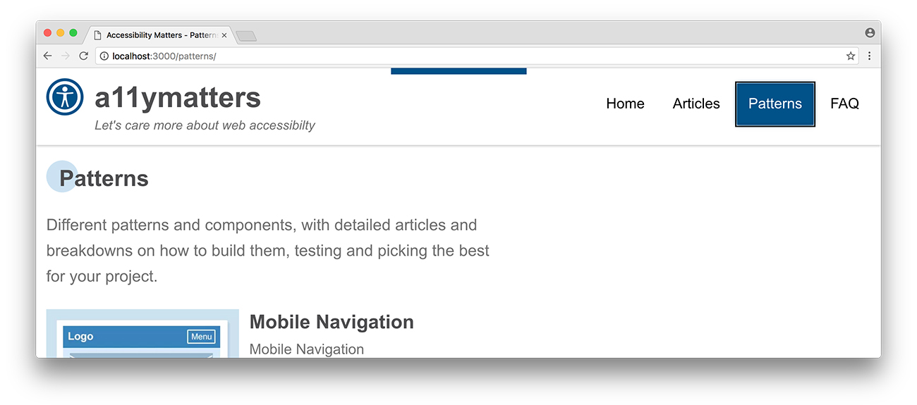
When setting the value of top property, be sure to test how it will look while changing the browser default font size. I didn’t take care of this point while working on a11ymatters design, notice the top edge of the browser. The skip link is not completely hidden off screen.

1
2
3
4
5
6
.c-skip {
    position: absolute;
    left: 50%;
    top: -2.5em; /* it's better to set this value in relative units, like em */
    padding: 0.75em;
}
For more info about that, read my article on CSS Tricks about building resizeable components with relative CSS units.
Final Demo
Click on the white area in the demo below and then start tabbing. Did you notice our skip link?
See the Pen a11ymatters - Skip Navigation Link by Ahmad Shadeed (@shadeed) on CodePen.
Share the article:
Did you like the article? Share it on Twitter
Did you like the article? You can hire me.
I'm a UX, UI Designer and Front End Developer. I focus on building accessible and easy to use websites and apps. Get in touch by email: [email protected]